Karat Design System
I joined Karat to implement a component library in Figma, revamp our codebase, and write supporting documentation. Here are the results:
1 design guide
A single starting point for anyone to find what they need.
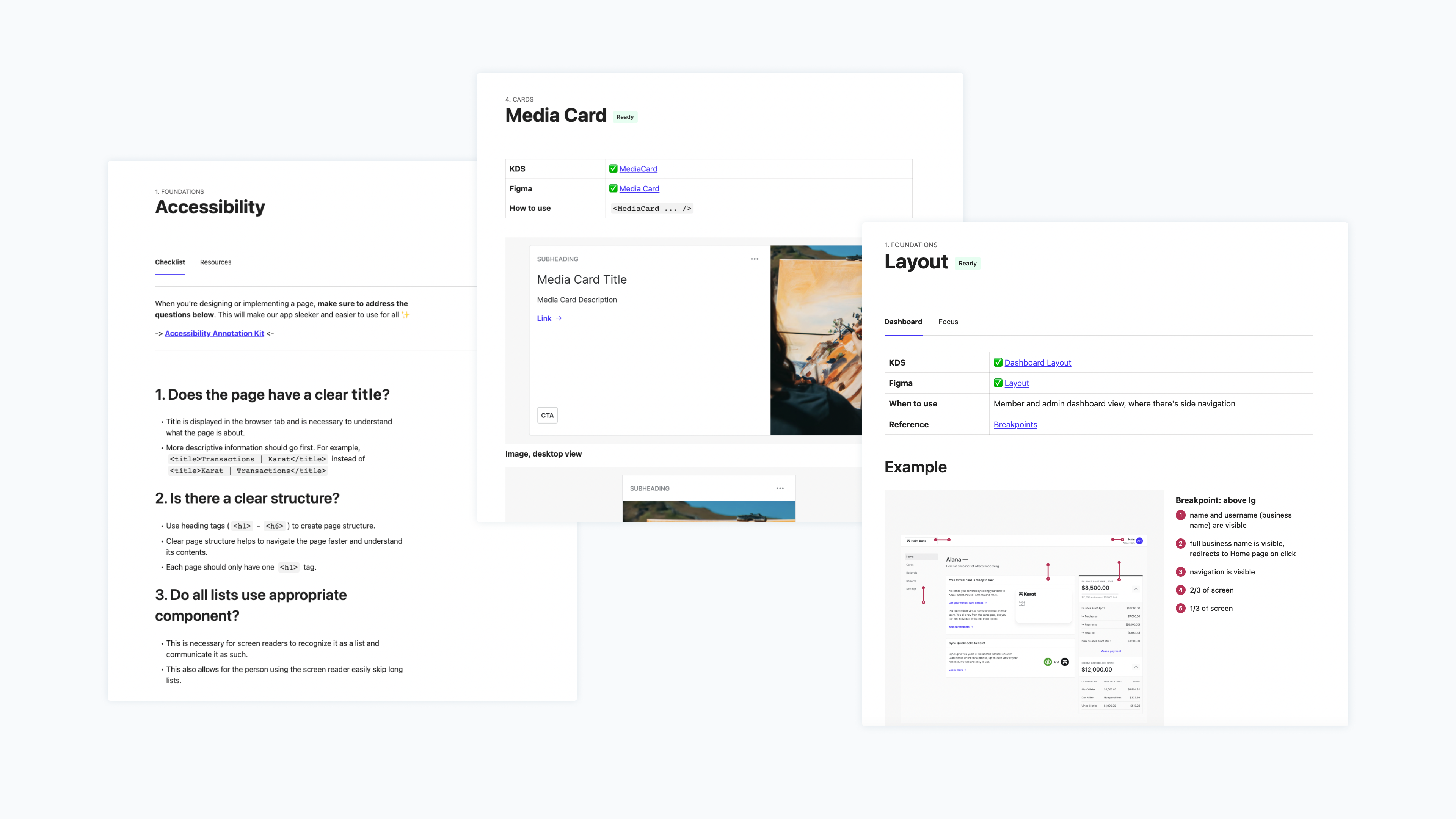
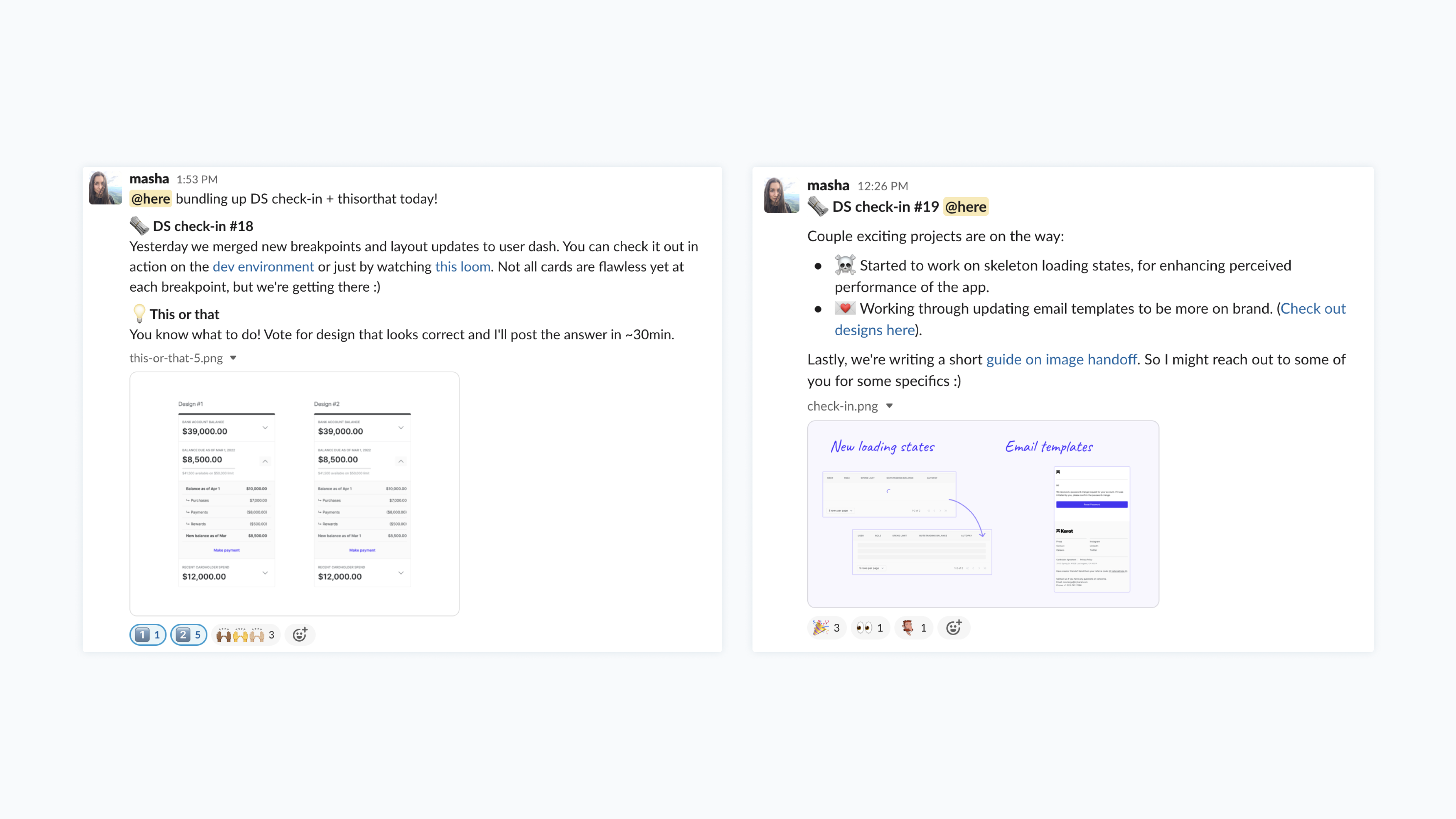
37 check-ins
We used a dedicated design systems channel to share the roadmap, post weekly updates, and get feedback.
Quality work
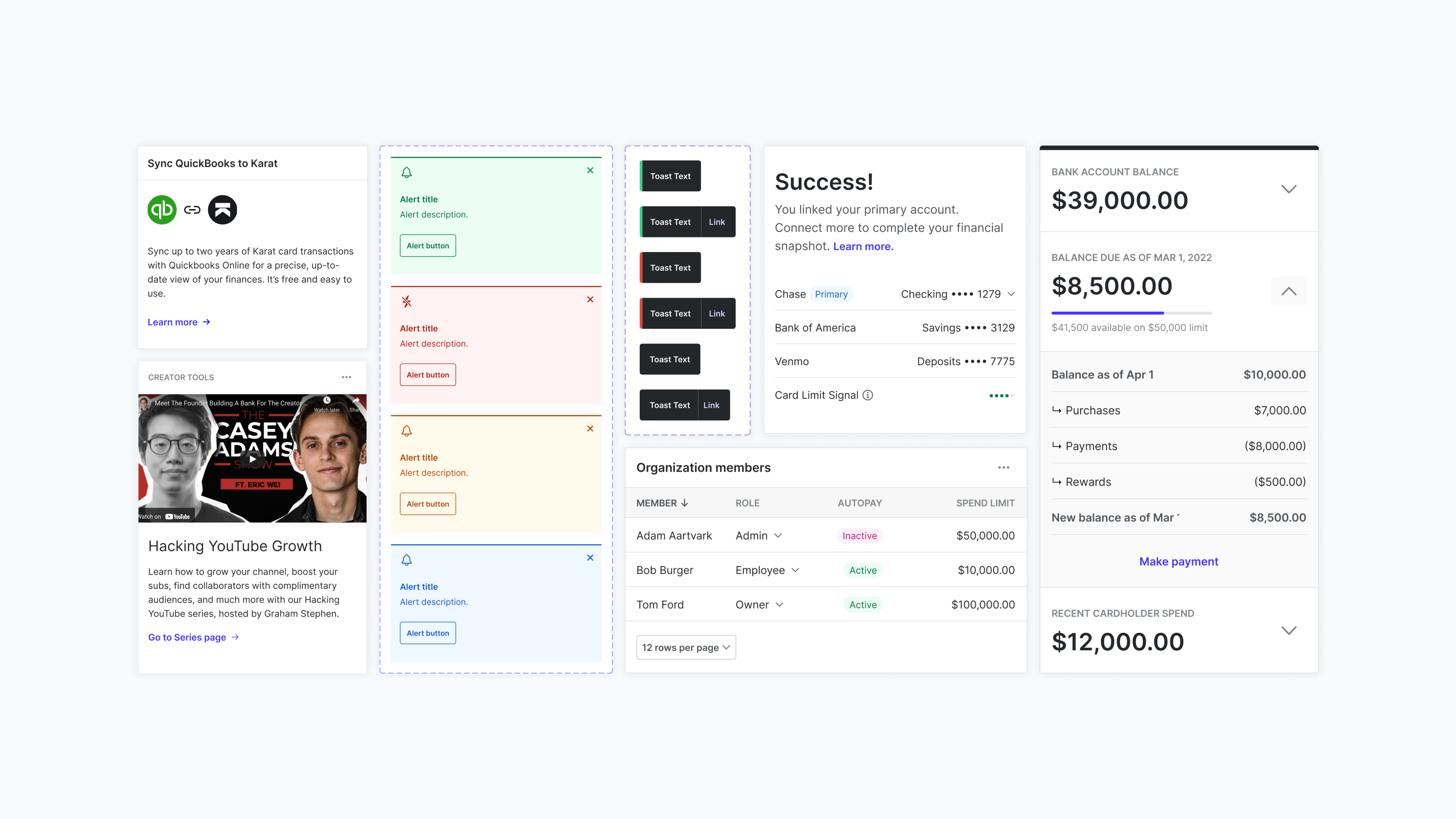
Figma component library allowed our designers, Mark and Cecilia, to work 2-3× faster. They could spend more time thinking about the problem and less time on mundane technicalities.
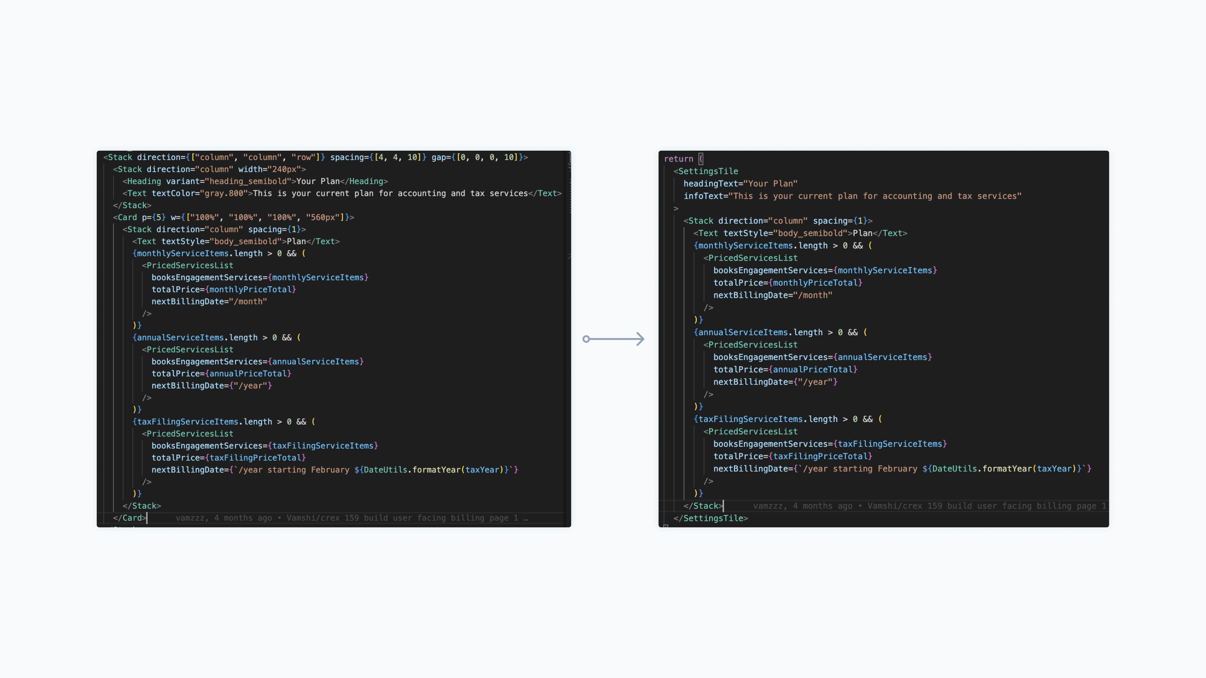
~100,000 lines of code removed
56 pull requests made, each removing on average ~2,000 lines of repetitive code and replacing it with ~300 lines.
~ 2,000 dev hours saved
At least. This calculation is based on just the following 10 components from our codebase:
| component | # instances so far | hours saved |
|---|---|---|
| Alert message | 25 | 85 |
| Button | 370 | 181 |
| Card | 135 | 397 |
| Input | 212 | 100 |
| Layout | 47 | 168 |
| Modal | 55 | 263 |
| Page header | 60 | 58 |
| Table | 70 | 338 |
| Tabs | 10 | 72 |
| Toast | 143 | 283 |
These hours could then be spent on launching our new Books product and enhancing our internal tool with nifty features (like a custom CMS or underwriting improvements).
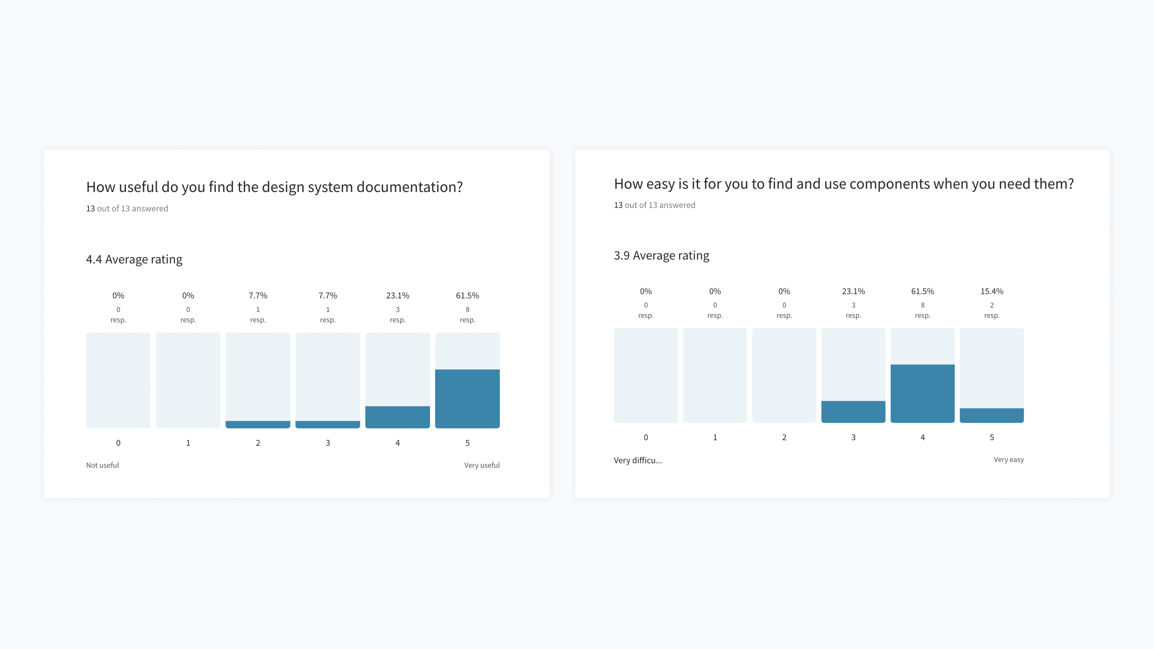
8.2 / 10 happiness score
At the end of 2022, we ran a desisgn systems survey with designers and developers. Here's the full report.
3 buckets of (happy) tears
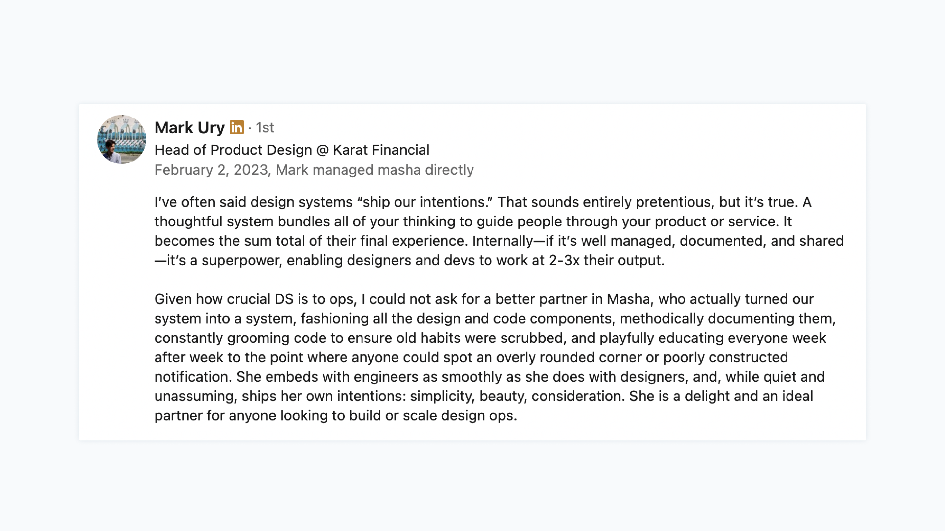
The amount I cried after I read my manager Mark's LinkedIn recommendation.
We did so much and yet, there was still so much to be done... (a better system for emails, more consistent loading states, design tokens, and much more). 💙