Underwriting — Feature design
About
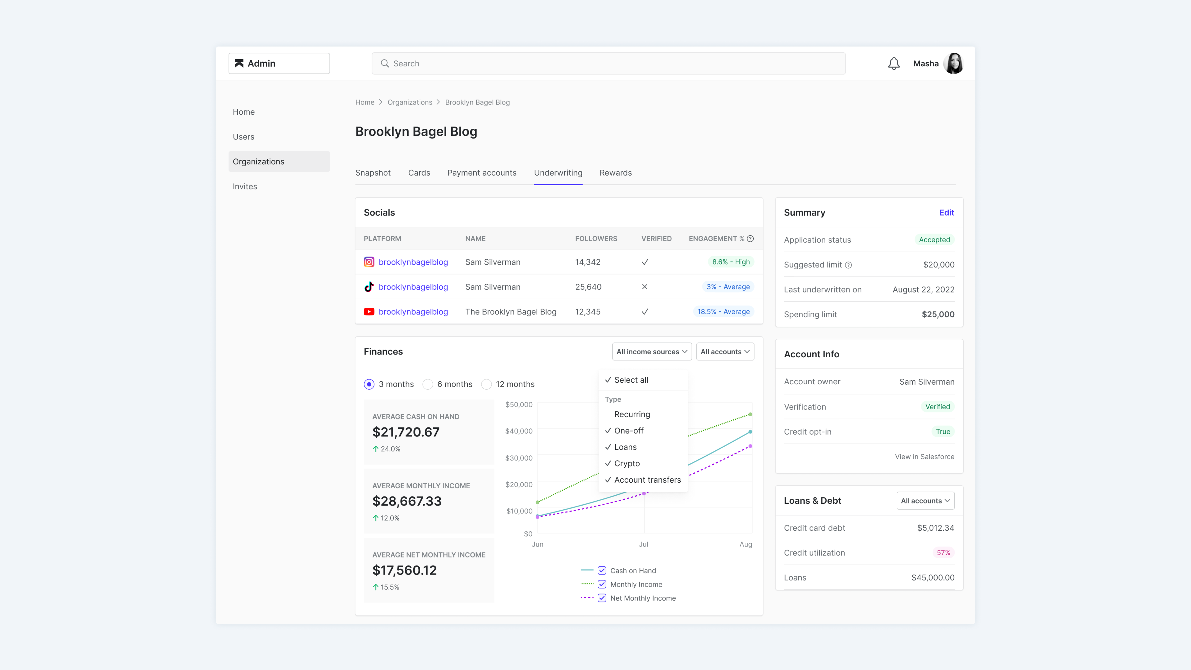
- Karat Financial is a bank for creators. Karat provides financial services, one of which is a credit card.
- Underwriting is the process of determining a person’s credit limit. Usually banks look at financials, employment, and credit history to determine that limit. At Karat, we also take into account the applicant’s social media presence.
Problems
We have an internal tool, where our risks analysts can view and record applicants’ underwriting information. Unfortunately, it wasn’t very user friendly, so we decided to redesign it.
After talking with our analysts, Rithika and Cynthia, we identified 3 main problems:
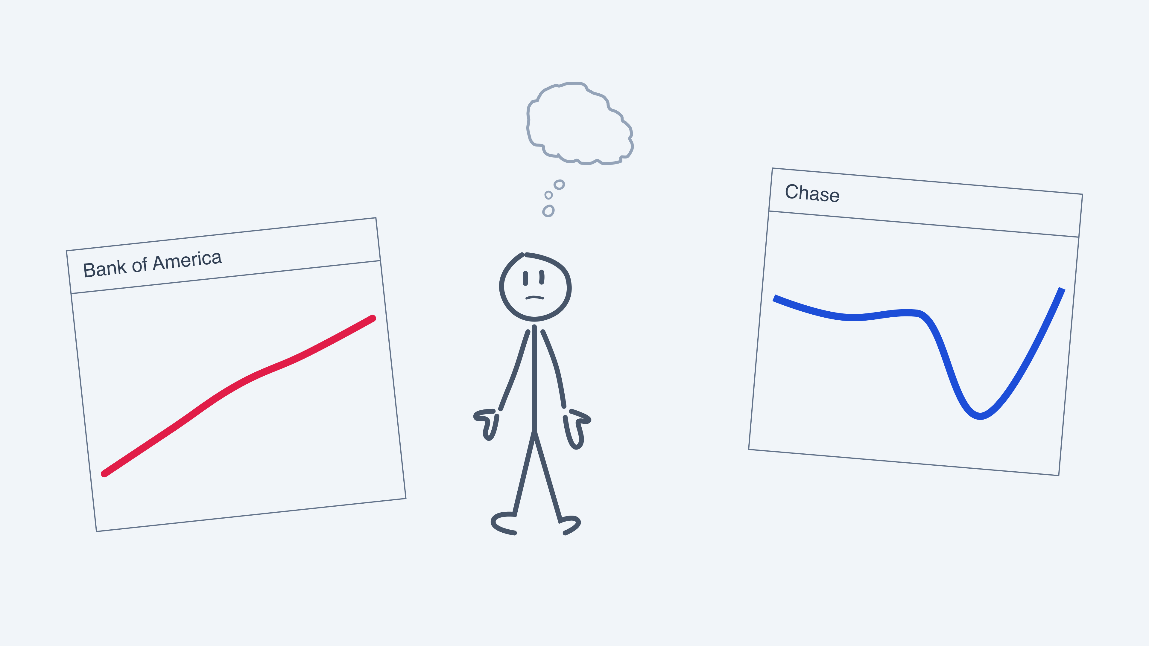
No big picture
If the applicant linked multiple banks, it was impossible to see the overall financial picture (you had to toggle between the banks).
Lack of clarity
It was difficult to understand the reasons behind drastic changes (which are common for creators) in their financial history.

Manual work
All work for examining socials had to be done manually. It was repetitive and took a significant amount of time.

Solutions
We added a way to display information from multiple banks at the same time. Also, an option to filter different accounts and transaction types.
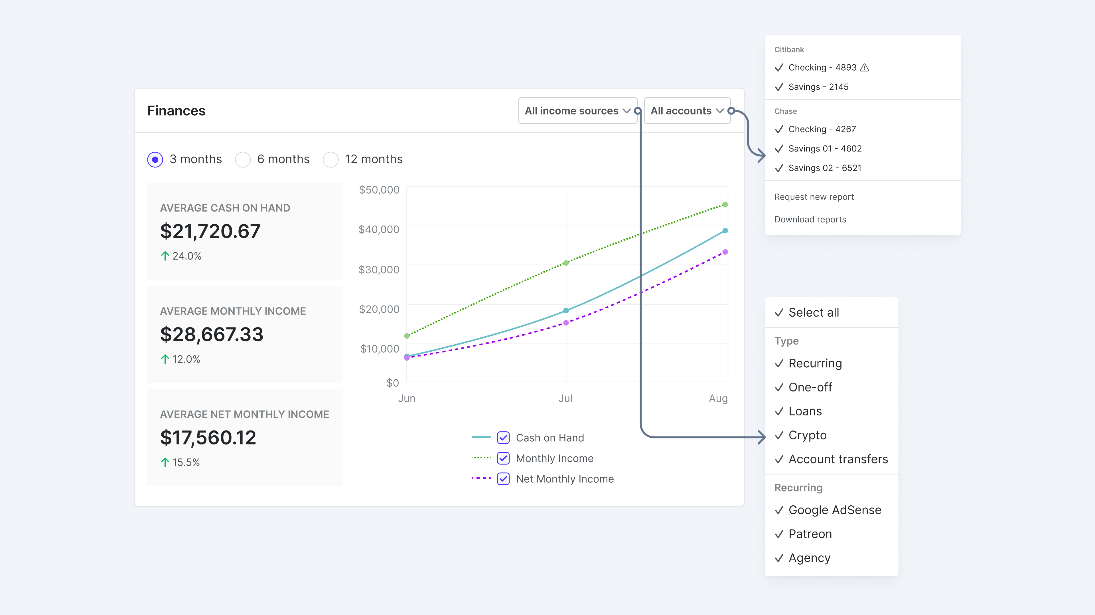
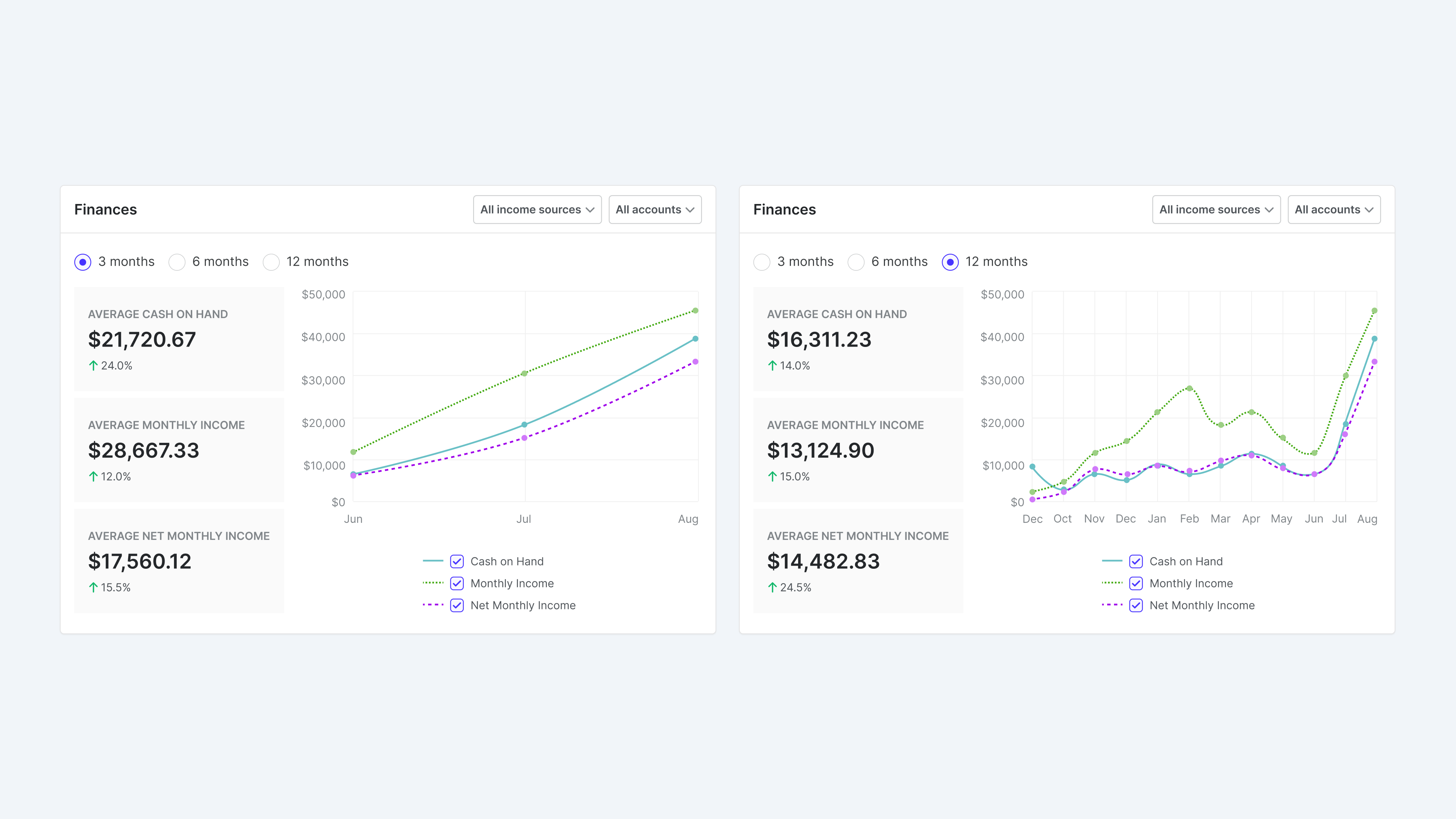
We added a way to filter history by the past 3, 6, and 12 months. This was the most feasible solution technically and gave clarity into any spikes or dips.
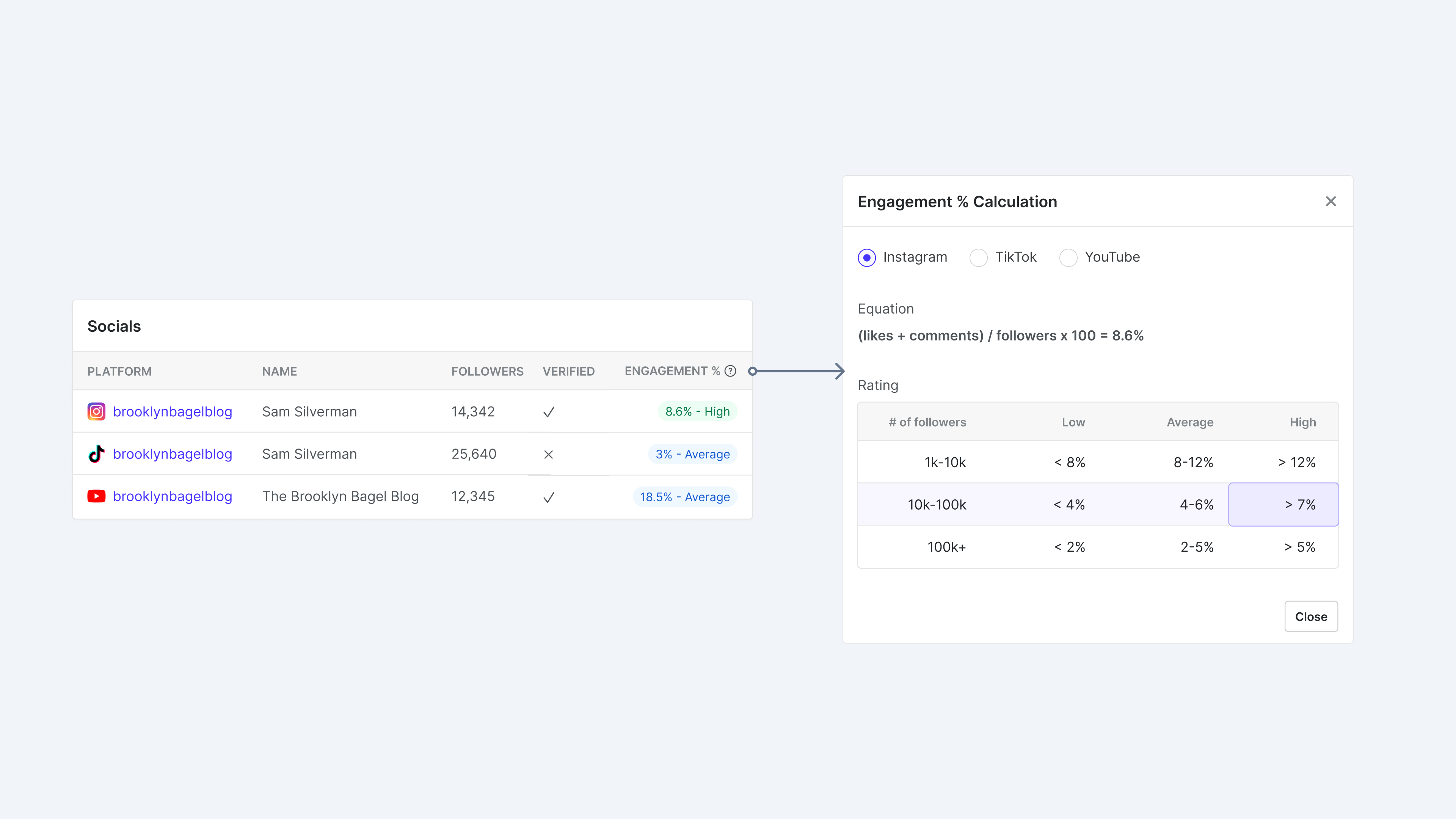
We surfaced more social data on the underwriting tab and a faster way to get to each account. We also started exploring automated ways to calculate engagement. While it wouldn’t be replacing human evaluation, it would be a better starting point for the analysts.
Results
- Together with other process improvements, we decreased the time it takes to underwrite each applicant.
- More clear insights led us to lower delinquency rates.
- And of course, it became much more pleasant to use the internal tool.